Previously, I ran a quantitative analysis of graph paper quality on 6 gridded notebooks I had handy. I scanned samples of paper from each notebook, used a computational method (K-means clustering) to compare the relative darkness of the paper’s background, the printed gridlines, and a dot of ink I drew.
On a recent trip to Tokyo, I picked up a bunch more notebooks. (I love Japanese graph paper.) All these notebooks were cluttering up my office, so I re-ran the experiment so that I can put them away.
For good measure, I included all the notebooks I used in the previous experiment. For good science, you must reproduce results.
Data
Here is the full set of samples (notebooks) I analyzed this time around.

For high-res photos of each notebook, look here.
For scanned samples of paper from each notebook, look here.
Procedure
The procedure was the same as last time: cut samples from each notebook, scan them, and run them through the analysis script. See my writeup of the last experiment for more details.
Equipment
- Canon Pixma MG5320 Scanner
- Pigma Micron 005 Black Ink Pen
- Various gridded notebooks
- Scissors
- iPhone X (camera)
- My Hackintosh with 40″ Display
Code
I made some minor adjustments to the code to accommodate the larger quantity of data I’m working with now. It’s still short and simple.

Results


All of the inkdot values are in the range [0.78, 0.82]. This is good, because I used the same pen for each, and this quantity will affect the ink/grid ratio (ink.grid.ratio in the table above).
Commentary
Replication
As I mentioned at the start, I re-ran most of the samples from the previous iteration of this experiment. Here’s a comparison of those results.

Nearly-identical results (check the Delta columns).
I did another kind of replication check, too.
I had a Kokuyo Filler from 10 years ago, which I had analyzed last time. I was able to find a new one of these at Okamoto Stationary in Ueno (Tokyo). I included both models in this test. The results were very close. My analysis said that the older model had darker gridlines (0.14 vs. 0.11). That seems fishy. I would’ve expected the grid lines to fade with time. Here’s a photo comparing them side-by-side.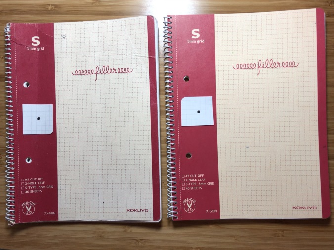
It looks like the older one actually does have darker lines! I guess Kokuyo has refined their design.
Background-Grid Interference
I accidentally bought a set of Kokuyo Filler’s with colorful covers, thinking they would be the same as the one with the red and tan cover. Boy was I wrong. Those suck.

Avoid!
You can see massive speckling in the cluster image, which indicates the problem.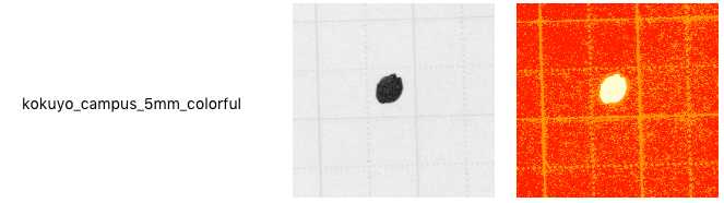
The background and gridlines are too close in darkness, making them difficult to distinguish.

This is also a problem in the Bienfang notebook. Based on the numerical results and cluster imagery, I expect the Okina Project Paper and Ca.Crea A4 (misspelled as cac.rea.a4_9) will exhibit the same problem.
Gridline-Ink Interference

The ALGO8 tops the gridline darkness charts. Those lines are too dark! But it did yield one of my most popular articles ever, Optimizing Handwriting, so it holds a special place in my heart.
Winners


Subjectively, my favorites are the Kokuyo Filler 5mm, the Fabriano EcoQua, and the Maruman Spiral Note 5mm. Especially the Maruman. That one is so nice I feel obligated to only write high-quality stuff in it.
NOTE: I haven’t used all 16 of the notebooks I scanned, so I can’t do a comprehensive analysis to determine optimal values for background, gridlines, and ink/grid ratio. That will have to come another day.